See where AI spend is going
This is the first stage of cost control, and nothing here limits anything. The whole purpose is to replace an opinion about AI spend with a number: what the organization is spending, whether that number is moving, and who owns the workload behind it. The output is a baseline and a set of owners, which is what the later stages (a budget, then an enforced cap) are built on. A cap set without this step is a guess.
Persona: Platform operator working in the Admin Console, often answering a question from an engineering manager or the finance owner.
Estimated time: 10 to 15 minutes to work through all three scenarios; 2 to 3 minutes for any one of them once the surface is familiar.
Outcomes
By the end of this guide:
- The organization's spend over the last 30 days is known, along with its direction of travel and the date of any inflection.
- Spend is cut by team, with two or more teams compared side by side and unattributed spend accounted for.
- Spend is cut by model, read in both cost and tokens, so traffic that a cheaper model could serve is identifiable.
- The filter, grouping, and export mechanics are understood well enough to answer a new question without a walkthrough.
Prerequisites
- Administrator access to the Admin Console, typically the
super_adminorbilling_adminrole. - API keys that follow the per-purpose convention established in Onboard developers and issue keys. A single organization-wide key that everyone uses makes attribution impossible: every scenario below collapses into one row.
- Group identity flowing in from the identity provider, so that team figures reflect the real org chart. See Map Entra ID groups to business functions.
- Enough traffic in the chosen time range to read a trend. A tenant three days old has no 30-day shape to report.
Scenario 1: how the organization is trending
The question, as it usually arrives: "What is the whole organization spending on this, and is the number going up?"
- Open Usage → Analytics in the Admin Console (path
/usage). - Clear any User or Team filter so the view covers the whole organization. Filters are encoded in the page URL, so a link arriving from someone else's investigation opens pre-filtered.
- Set the time range to Last 30 days.
- Set Group to No grouping, which reduces the chart to a single series for the organization total.
- Read the total for the period, then switch the range to Last 7 days and Last 24 hours.
How to read it:
- The direction matters more than the total. If spend is flat, the last 7 days sit at roughly a quarter of the 30-day figure. Materially above that means an increase is in progress and the monthly total has not caught up with it yet.
- The shape names the cause. A step change on one day is something a person did: a team onboarded, an agent shipped, a model swapped, a limit raised. A gradual ramp over several weeks is adoption or drift, and drift is the case that goes unnoticed longest.
- Date the inflection before explaining it. Narrowing the range to the week around the step, then switching to the By API Key breakdown, shows which key started or accelerated on that date. That key is the thread to pull.
A trend read once is a data point; read on a cadence it becomes a control. The weekly version of this review is in Catch spend drift before the invoice does, and an unexplained step change is traced to the configuration change behind it in Audit Agent Router activity.
Scenario 2: which team is spending it
The question: "Fine, but cut it by team. Which teams are driving that number, and how does mine compare to theirs?"
- Open Usage → Analytics and keep the time range on Last 30 days.
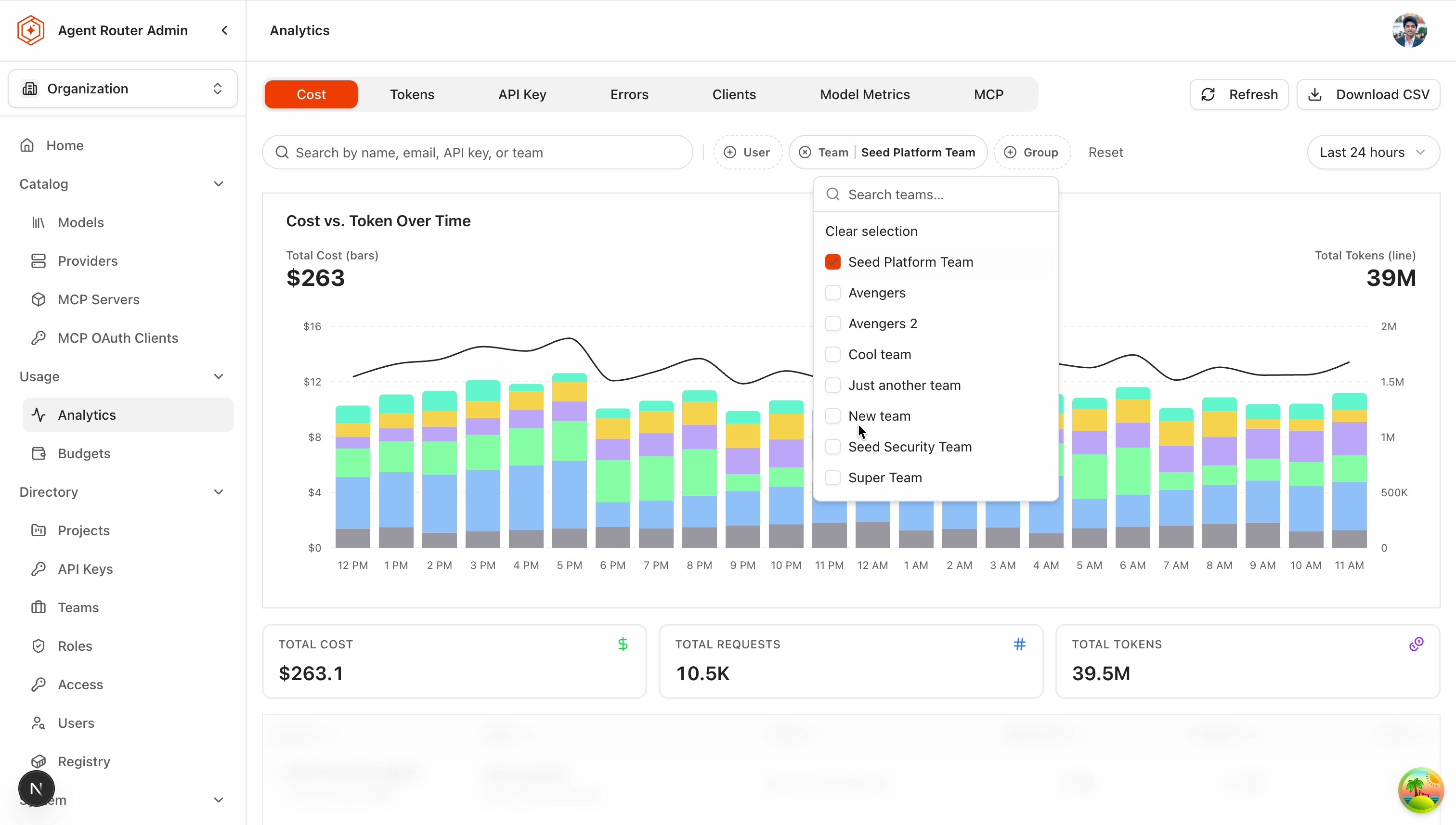
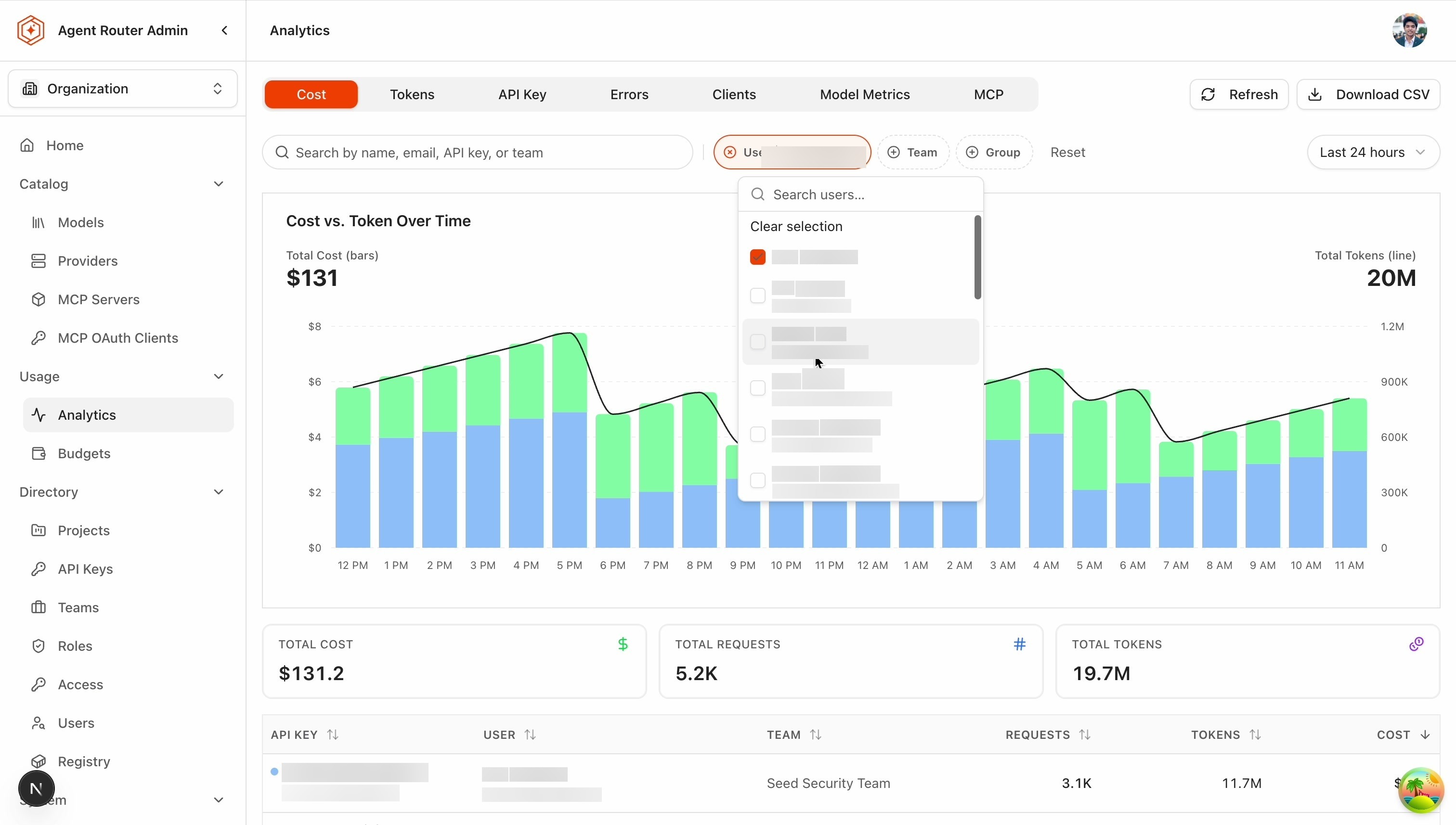
- Open the Team filter and select the teams of interest. The picker stays open while selections are made, and current selections stay visible at the top while the list is searched, so a name can be found in a long directory without losing the picks already made.
- Confirm the chip: it shows the team name for a single selection, or a count such as 2 teams for several.
- Select No team assigned as well, at least once. Spend from people who belong to no team is real spend that no owner will claim, and it is invisible in a view that only lists real teams.
- Read the comparison on the chart. On the second selection the chart switches to one color per team automatically.
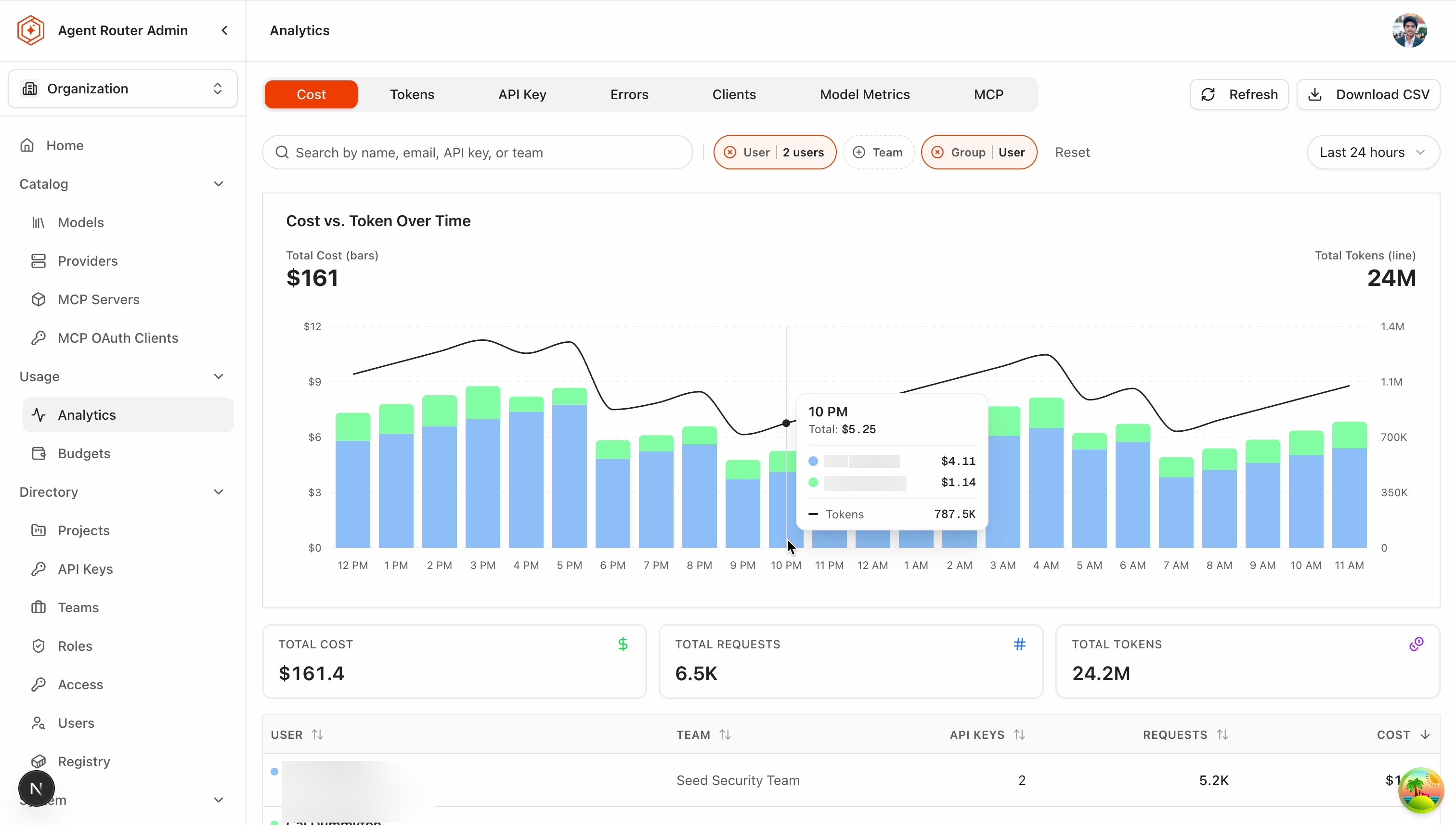
To rank the individuals inside one team rather than compare teams against each other, filter by the team and set Group to User. The same multi-select behavior applies to the User filter.
How to read it:
- Compare share, not just totals. A team that holds 40% of spend and 40% of the engineers is unremarkable; a team that holds 40% of spend and 8% of the engineers is the conversation.
- User and Team filters narrow rather than add. Selecting one person plus one team shows that person's usage within that team, so a person who is not in the selected team returns an empty result. That is expected, not a fault.
- Team figures are only as good as the membership behind them. A person mapped to the wrong group is spend attributed to the wrong owner, and the error surfaces as a dispute rather than as an error message.
- An unclaimed row is a finding. A large No team assigned figure usually means contractors or service accounts were never mapped. Until they are, that spend has no owner and stays central.
Scenario 3: which models carry the workload
The question: "Cut it by model. What is actually consuming this, and is any of it work a cheaper model would do just as well?"
- Open Usage → Analytics with the time range on Last 30 days.
- Select the By Model breakdown.
- Sort by cost descending and note the top three or four rows.
- Switch the measure from cost to tokens and compare the two orderings. The models that change rank between them are the interesting ones.
- Apply a Team filter to attribute a specific model's consumption to an owner, since the breakdown and the filters compose.
How to read it:
| What the two orderings show | What it means |
|---|---|
| High cost, low tokens | A premium model on a small volume. Expensive per unit of work, which is correct for genuinely hard tasks and wasteful for anything else. |
| High tokens, low cost | Bulk work served cheaply. This is the intended shape and needs no action. |
| High on both | The workhorse. A change here moves the organization total more than a change anywhere else. |
| Present but negligible on both | An experiment, or a leftover default in one client's configuration. Worth confirming it is deliberate. |
The candidate for a change is a premium model sitting on high-volume, low-difficulty traffic: classification, extraction, summarization, or autocomplete. That is a routing decision rather than a budget one, and the model-tiering patterns are in Smart routing. The By Provider breakdown answers the adjacent question of which contract is bearing the load, which matters where more than one provider serves the same model family.
Search, group, and export
The mechanics below apply to all three scenarios and are worth knowing once rather than rediscovering per question.
- Searching within a filter. The User and Team pickers include a search field. Selections already made stay pinned at the top while the list is searched, so building a set of five people out of a directory of five hundred does not require restarting.
- The selection limit. Up to 50 users or teams can be selected. Past that, the picker asks for a removal before another is added.
- What Group does. The Group control decides what each series on the chart represents: a user, a team, or nothing (No grouping), which collapses the view to one series for the filtered total. With several users selected and No grouping, the individual API keys appear instead, each labeled with its owner (for example Ada · prod-key), which is the view that separates one person's production traffic from their experiments.
- Auto-grouping is a default, not an override. Selecting a second user or team switches the chart to one color per user or team, but only while no explicit Group choice has been made. An explicit choice always sticks and is never changed silently.
- Filters narrow. User and team combine by intersection, as described in Scenario 2.
- Drill-down. Clicking a bar on the chart, or a row in the table, focuses that user.
- Sharing a view. Filters are part of the page URL, so a link reproduces the same selection for the recipient. Names resolve according to the recipient's own permissions, so a viewer with narrower access sees fewer of them.
- Exporting. Download CSV exports the current selection. The chart, the table, and the export all follow the same filters, which cuts both ways: a filter left over from an earlier investigation ends up in the file. Confirming the range, the breakdown, and the filters before exporting takes a few seconds and prevents a statement being sent with an accidental scope.
What the numbers mean
Two measures are available, and treating them as interchangeable is the most common misreading of this page.
| Measure | What it describes | When it is the one to use |
|---|---|---|
| Cost, in US dollars | The workload translated into money at published model prices | Budget conversations, chargeback, anything finance consumes |
| Tokens | How much work is actually being asked of the models | Comparing efficiency over time or between teams, since token counts are stable across pricing changes |
Both are needed to explain a change. The same rise in cost is produced by more traffic or by a switch to a more expensive model, and only the token figures separate the two: cost up with tokens flat is a pricing or routing change, and cost up with tokens up in step is simply more work.
Since 0.3.0, usage also breaks down by mode: managed traffic served on centrally managed provider credentials, BYOK traffic on the organization's own provider keys, and passthrough traffic paid for by a provider subscription. Passthrough usage appears in the spend overview but is not billed spend and does not consume a budget. In the same release, every calculated cost figure carries a measurement label of actual, partial, or estimated, saying whether it was measured, partly measured, or derived entirely from tokens and catalog prices.
Cached input tokens are a third figure worth knowing, because providers bill them at a fraction of the list price, so the same behavior at a higher cache-hit rate costs less. They are read per request rather than as an Analytics measure: the token breakdown in the request detail panel of the Request logs view reports input tokens served from cache where the provider supplies them, and the share across a set of requests is estimated from a sample of them.
Cost per task is the figure that travels furthest outside the team: the spend for a window divided by the units of work completed in it, whether those are merged pull requests, closed tickets, or answered questions. Unlike tokens and request counts, it survives comparison across agents, models, and weeks, and it is where a budget conversation usually lands. Analytics supplies the spend side of it, filtered to the key or team in question; the count of completed work comes from wherever that is already tracked.
Spend is worked out from the tokens in each response and the price of the model that served it, with prices drawn from a catalog of published provider pricing. It is not read from the provider's bill. For a baseline and a trend that is entirely adequate, and the proportions between teams hold even where the absolute total does not. For an allocation that charges real money, the discrepancy has consequences (negotiated rates, committed-spend agreements, provisioned capacity), and those are set out in Split the AI bill across the teams that caused it.
Where to go next
A baseline read once and then filed changes nothing. Two things turn it into a control: putting a number on it, and reading it again next week.
Set a budget and track spend against it
Stage 2. Turn the baseline read here into a spend limit with a live meter and an alert.
Split the AI bill across the teams that caused it
Export a closed-period statement for chargeback, and reconcile it against the provider invoice.
Repeat Scenario 1 on a cadence
So a surprise is at most a week old when it surfaces.
Add a project dimension
Where the owners are initiatives rather than teams.