Compare user and team spend in Analytics
The User and Team filters on the Analytics page (/usage) let you select more than one at a time, so you can compare people or teams side by side. The chart, the table, and the CSV export all follow your selection.
Persona: Platform operator working in the Admin Dashboard.
Estimated time: 5--10 minutes once you know who to compare.
Outcomes
By the end of this guide:
- Several users or teams are selected in Analytics, and the chip shows either a name or a count such as 2 users.
- Side-by-side spend is visible on the chart (one bar color per user or team), or a deliberate Group choice is preserved.
- Narrowing combinations (user within a team), No team assigned, shareable filter URLs, and the 50-selection limit are understood.
Prerequisites
- Administrator access to the Admin Dashboard: typically the
super_adminorbilling_adminrole. - Enough usage in the chosen time range for the people or teams you intend to compare.
Step 1: Filter by several users or teams
- Open Usage → Analytics in the Admin Dashboard.
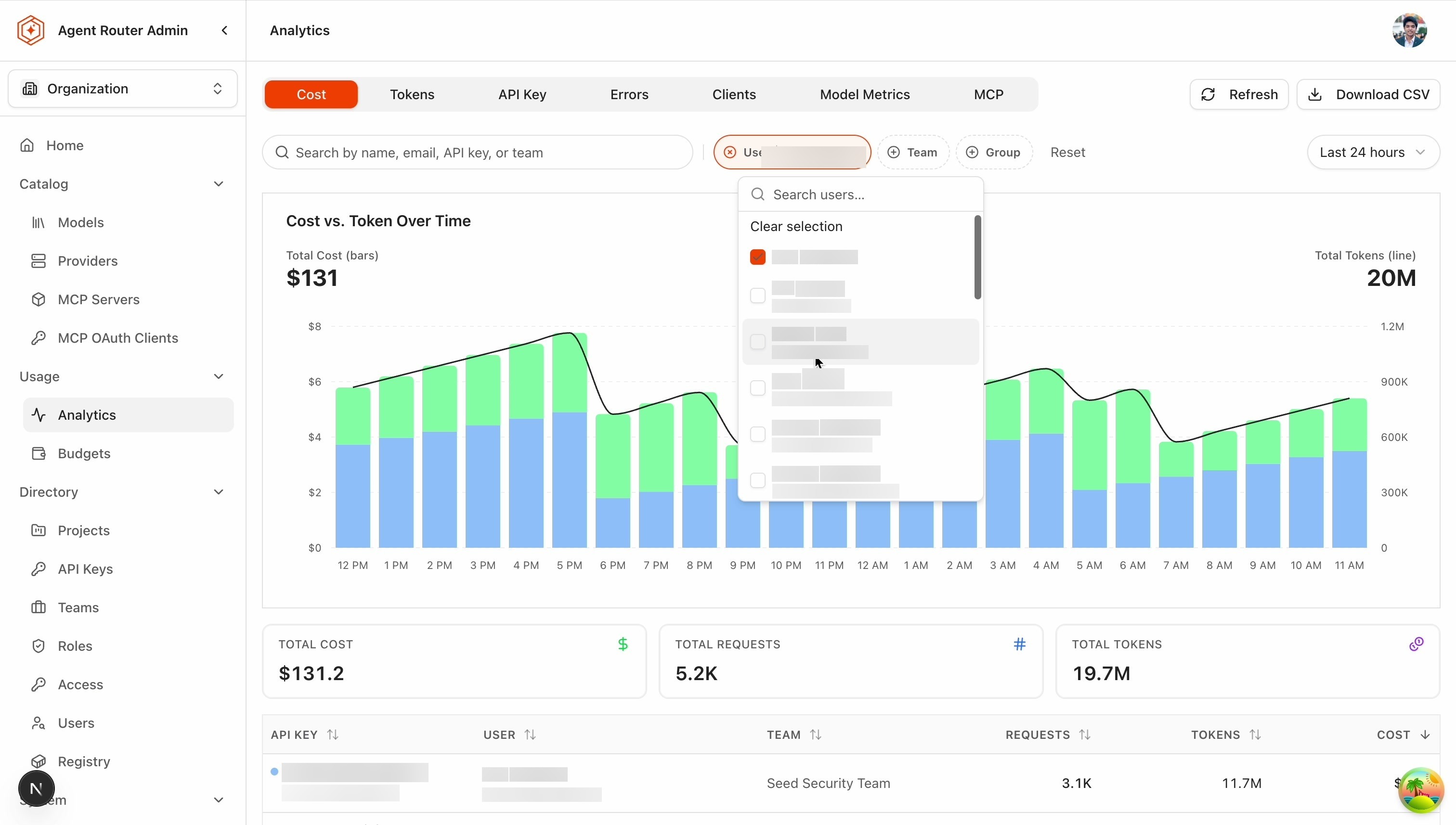
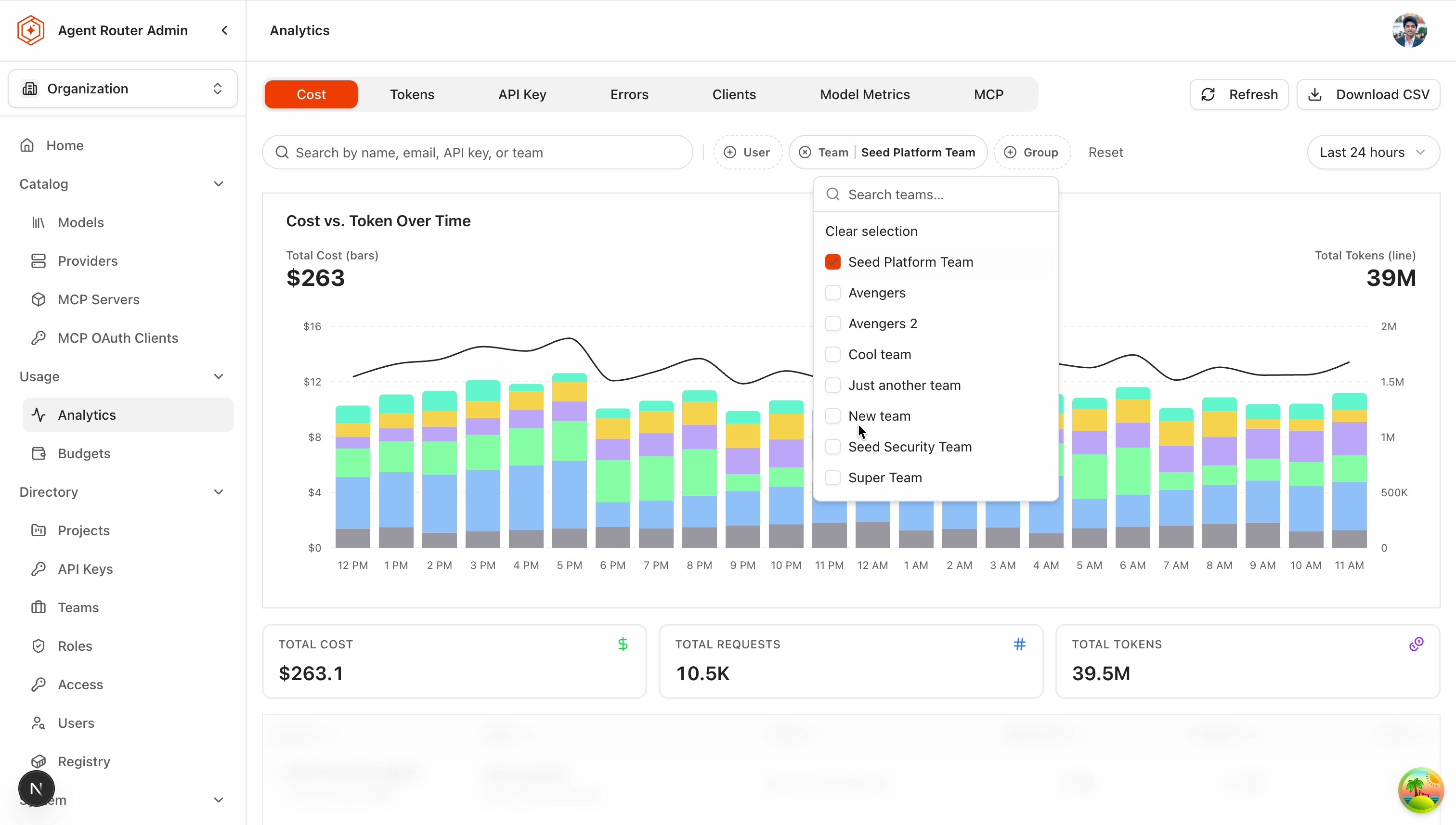
- Open the User (or Team) filter and tick the people or teams you want. The list stays open while you pick, and your selections stay visible at the top even while you search.
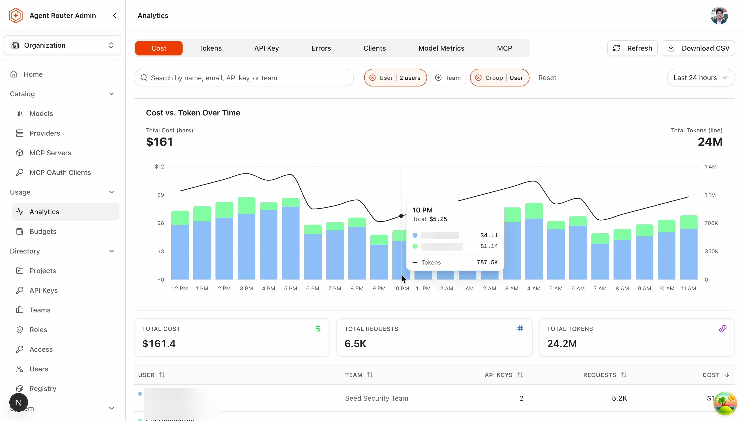
- Confirm the chip: it shows the name when one is selected, or a count like 2 users when more are selected.
- Confirm that the chart, the table, and Download CSV all follow your selection.
Step 2: Compare them on the chart
- The moment you pick a second user or team, the chart automatically switches to one bar color per user (or per team) — that is usually what you want when comparing.
- This only happens if you have not chosen a grouping yourself. If you pick something in the Group control (including No grouping), your choice sticks and is never changed for you.
- With several users selected and No grouping, you see the individual API keys instead, and each key is labeled with its owner (for example Ada · prod-key) so you can tell whose key is whose.
- Clicking a user's bar in the chart, or their row in the table, focuses on just that person.
Step 3: Combine filters and share the view
- User and team filters combine by narrowing: selecting Ada plus the Security team shows Ada's usage within the Security team. If she is not in it, the result is empty — that is expected.
- To see one person compared against their teammates, filter by the team and group by User.
- No team assigned is available in the Team filter for usage from people who are not in any team, and it can be combined with real teams.
- Filters are part of the page URL, so you can share a link and the other person sees the same selection (names are resolved on their side based on their permissions).
- Up to 50 users or teams can be selected; past that, the picker asks you to remove one before adding another.
What to do next
- Catch spend drift before the invoice does: run this comparison on a cadence as part of the weekly review. See Catch spend drift before the invoice does.
- Bill AI spend back to the teams that incur it: export the filtered selection for chargeback or showback. See Bill AI spend back to the teams that incur it.
- Keep each team's spend inside an agreed ceiling: turn baselines you read here into budgets. See Keep each team's spend inside an agreed ceiling.
Where to go next